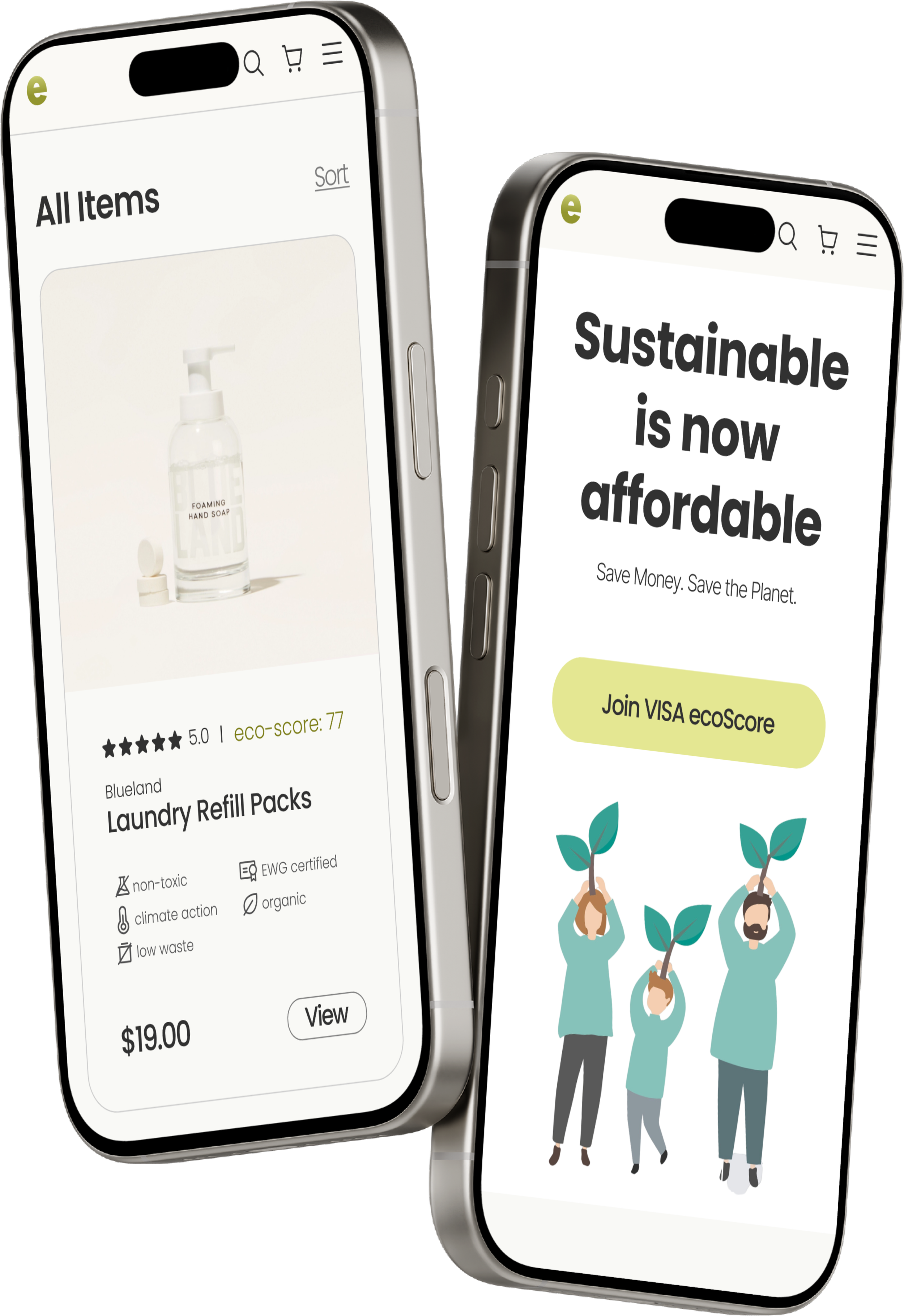
Effortless Sustainable Shopping-
Chrome Extension + Responsive Website
Global warming is a critical reality, with 2023 being the hottest year on record. Recognizing this urgency, VISA launched a climate tech hackathon to explore green fintech solutions. Our goal was to bridge the intention-action gap in sustainable consumer choices, a shift that could reduce global emissions by 40%.
My Roles
UX/UI designer
My Team
2 developers,
1 data analyst
Tools
Figma/FigJam, Procreate
Duration
May 2024 (3wks)
Problem
Despite growing environmental awareness and the rise of eco-friendly marketplaces, many shoppers still struggle to align their intentions with their actual purchasing behaviors. Why do shoppers find it difficult to follow through on sustainable choices?
Solution
Leveraging machine learning, VISA spending data, and our own research, we developed ecoScore—a Chrome extension powered by an ML algorithm for real-time sustainability ratings and VISA-sponsored e-commerce platform, during online shopping. It also guides users to discounted, eco-friendly alternatives.
Scroll down to see my process
⬇️
VISA has integrated sustainability into its operations, reducing operational carbon footprint, offering biodegradable credit cards, seeking new solutions, etc. 2024 hackathon’s theme: How to leverage payment data to improve global sustainability? Examining 3 years of raw expense data from 5 families provided by VISA, revealed high spending areas: Grocery and Household items. This discovery shaped the direction of our initiative— How might we encourage shoppers to adopt more sustainable habits when buying groceries and household items?
Background
We used VISA payment data to pinpoint high-spending areas for our hackathon project
Household items
Grocery
Through forums, online research, and AI—I identified competitors for ecoScore. My goal is to understand their pros and cons, identify patterns that attract or deter shoppers, and explore factors that influence eco-friendly shopping habits: their successful strategies and potential market gaps.
Competitive Analysis
-
Earthy theme
Wide range of products
With a wealth of eco-friendly resources
Chrome extension design
-
A cleaner user interface
Address browser compatibility for broader accessibility
Incorporate more visual elements for user engagement
-
Beauty & personal care, babycare, clothing & accessories, health, groceries, pet supplies, toys & games, electronics
-
Chrome extension
Blog
Eco-Rating
-
Relatively contemporary website design
Wide range of products
Accessible through popular platforms like Target/ Amazon
-
Expand product selection for wider audience appeal
Expand zero-waste alternatives across product lines to maximize impact
-
Home decor, food & drink, women, beauty & wellness, jewelry, paper & novelty, kids & baby, pets, men
-
Blog
-
Earthy theme
Subscription based business model
Subscribe and save incentive program
Live chat support
-
Provide more various of products
Modernize & streamline the website design
Provide a stronger incentive program
-
Home & kitchen, cleaning, bathroom, beauty, baby & kids, pets
-
c
-
Earthy theme
Cluttered website layout design
Limited household item offered while no grocery
-
Digeestable eco-friendly information
Streamline certification for small businesses
Modernize website design
Include engaging multimedia content
-
infection control, cleaning, catering, first aid, etc
-
No specific educational resources on their website
Business opportunities:
These eco-friendly brands emphasize natural and earthy aesthetics.
Most brands prioritize informal education materials in blogs, but scientific evidence is needed.
Most brands only offer limited household items categories without groceries.
Primary Research
Despite eco-consciousness, shoppers need sustainable info, convenience, and affordability to follow through
To identify how to help shoppers engage more in eco-friendly shopping despite the abundance of grocery/ household items marketplaces, I conducted survey & interviews. This also aids in selecting relevant interview participants matching VISA's user demographics to obtain representative insights. The result informs us how might we create a seamless, incentive, eco-friendly shopping experience that fits naturally into shoppers' routines.
We aim to learn:
Eco-awareness across the target audiences?
What are the regions with sustainable engagement?
What drives / hinders eco-shopping?
Users:
5 Household Items Shoppers - 2 singles & 3 has families
Shoppers’ pain points:
Knowledge gap
Shoppers unaware of product impact, struggle to verify eco-friendly options
Price concern
Eco-friendly products are often pricier
Convenience is key
Shoppers avoid multiple marketplaces or actively seek eco-friendly products
Personal benefit
Shoppers prioritize personal health and benefits > global impact
Affinity map was performed to synthesize key insights. This partial view shows how I got the insights. Click the link for the full report and the image to enlarge.
How might we seal the gap between shoppers' green intentions & actions?
User Journey
User shopping cleaner on Amazon
Shopper finding Amazon product's lack of eco-friendliness through ecoScore Chrome extension
Shopper finding better products on ecoScore site though ecoScore Chrome extension
Happy shopper
Early Sketches: Chrome extension + Sustainable marketplace
Sustainable marketplace
Chrome extension
Chrome extension with ML algorithm for eco score
Not eco- friendly product on Amazon
Brand Design & UI Kit
Color: Earth-toned greens and blues chosen for their calming / nature / health association, inspired by competitive analysis and user interviews.
Typography: Poppins was selected for it’s modern geometric sans-serif design, rounded letterforms, and even spacing.
Solution components
The ecoScore platform promotes sustainable shopping through a Chrome extension that integrates with major e-commerce sites like Amazon. On product page, we used an ML algorithm to provide real-time sustainability ratings based on recognized systems like Environmental, Social, and Governance (ESG) score, guides users toward eco-friendly choices on both the ecoScore website and their preferred shopping platforms. Additionally, the ecoScore website features high-spending product categories, scientific insights, and VISA sponsorship to support informed, sustainable purchasing decisions.
Component 1:
Chrome extension integrates with popular marketplaces
Component 2:
Chrome extension using an ML algorithm to rate product sustainability & provide alternatives on product page
Component 3: Chrome extension guides users towards more sustainable shopping choices
Component 4: Sustainable marketplace
Usability Test
Moderated usability tests with 5 participants were conducted via Google Meet to evaluate ecoScore's usability. Key goals included pinpointing task completion barriers & user pain points, gathering user feedback on overall functionality, visual design, and user flow efficiency for the Chrome extension, website, and purchase task. Click the links for full Usability Test Plan; Usability Test Report; Usability Test Affinity Map.
I aim to learn:
Task completion time?
User task completion barriers & pain points
Functionality and design feedback?
Insights:
Users want more info, without overwhelm
Users appreciate ecoScore’s convenience and design
Key findings:
5/5 users finding the Chrome extension integrates into their shopping routine seamlessly.
5/5 users love the the minimal aesthetics including favicon, logo, color theme.
5/5 users finish purchase task flow starting from Chrome extension within 1’ 20”, relatively swift compared to industry averages.
2/5 users want even more eco-friendly information throughout the shopping process.
2/5 users want to see more product information before they scroll down.
4/5 users found the VISA incentive is still not compelling enough for them.
ecoScore needs stronger business model and more sponsors
Iteration
Usability testing revealed that users want concise yet detailed eco-friendly information while also accessing more product details without scrolling. So I redesigned the layout by reducing image sizes, prioritizing key details like reviews, adding more product info upfront, and creating a clear eco-label to prevent overload.
1. Providing informative sustainability labels
Before
After
From both primary research and usability testing, I learned that users need trustworthy, scientific data to avoid being misled by advertising and ensure their money goes toward truly sustainable products—without feeling overwhelmed. To address this, I designed a tooltip that concisely explains our scoring system and evaluation process.
2. Providing score breakdown without overwhelming the shoppers by tooltip
Before
After
After
Prototype
Final Thoughts
What we accomplished
Using VISA finance data to identify groceries and household items as high-spending areas to effectively foster eco-consciousness.
Identified limited knowledge, access, and high costs hinder eco-friendly practices. Most consumers, despite environmental awareness, prioritize price, convenience, and personal benefits over seeking knowledge.
Developed Chrome extension that integrates with popular shopping platforms with sustainability score & redirects users to our curated earthy esthetics, VISA incentivized, eco-friendly e-commerce website.
Turned the dense scientific information into bite-sized user friendly product info.
Improvement and Reflection
One key challenge in this hackathon project was managing time constraints, which prevented the development of an eco-activity tracking feature that could have further enhanced user engagement and provided meaningful insights into environmental impact. From this experience, I learned the importance of improving team efficiency through clearly defined roles, including those of project managers, creating detailed timelines, assigning a minute-taker for meetings, and documenting plans, progress, and feedback in written formats to foster better collaboration and accountability. Additionally, I realized that an over-emphasis on implementation led to insufficient focus on the slide presentation, highlighting the need for a better balance between execution and communication. Finally, I also recognized that EcoScore needs a stronger business model. Typical credit card incentives range from 1–5%, but even at the higher end, a 5% VISA reward isn't compelling enough to drive user behavior or differentiate the offering. This insight underscored how crucial a sustainable financial strategy is—not just for user incentives, but also for securing partnerships and sponsorships to support long-term growth. Moving forward, I plan to integrate these lessons by streamlining workflows, enhancing team collaboration, and delivering well-rounded outputs that address both product functionality and business strategic viability.
<< Previous
Adding an AI-driven personalized stylist feature to ASOS e-commerce
Next >>
Redesigning a Background Check Website for Faster Task Completion


